Saratoga Spa State Park Golf Course, iloveny.com
"You can't get there from here."
Imagine traveling to a small town where you don't know the language, heading to a B&B, only to find yourself back where you started.
Some websites feel like that, too.
OVERVIEW
iloveny.com is a site devoted to travel and tourism in New York State. I was asked to assess the desktop version, specifically its structure, content labels, and overall usability.
ROLE
UX Researcher, UX Designer, Information Architect
METHODS
Heuristic Evaluation, Open Card Sort, Closed Card Sort, Sitemapping, Task Flow, User Flow
NOT A HOUSE OF CARDS
Heuristics, taxonomies, ontology. Heady terms for engaging, defining, and organizing stuff on a website. In other words, a site may look lovely, but if you don't know where you're going, well, you might not get there. Labels matter.
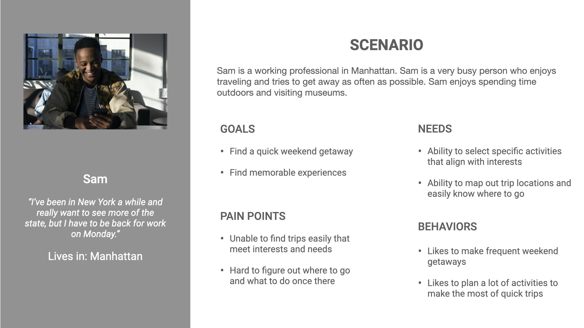
I needed to assess the structure and usability of iloveny.com for a pre-determined target audience: young, physically active urban professionals. I would then recommend site revisions to help them realize the goal of finding a weekend getaway.
Persona
HEURISTIC ANALYSIS
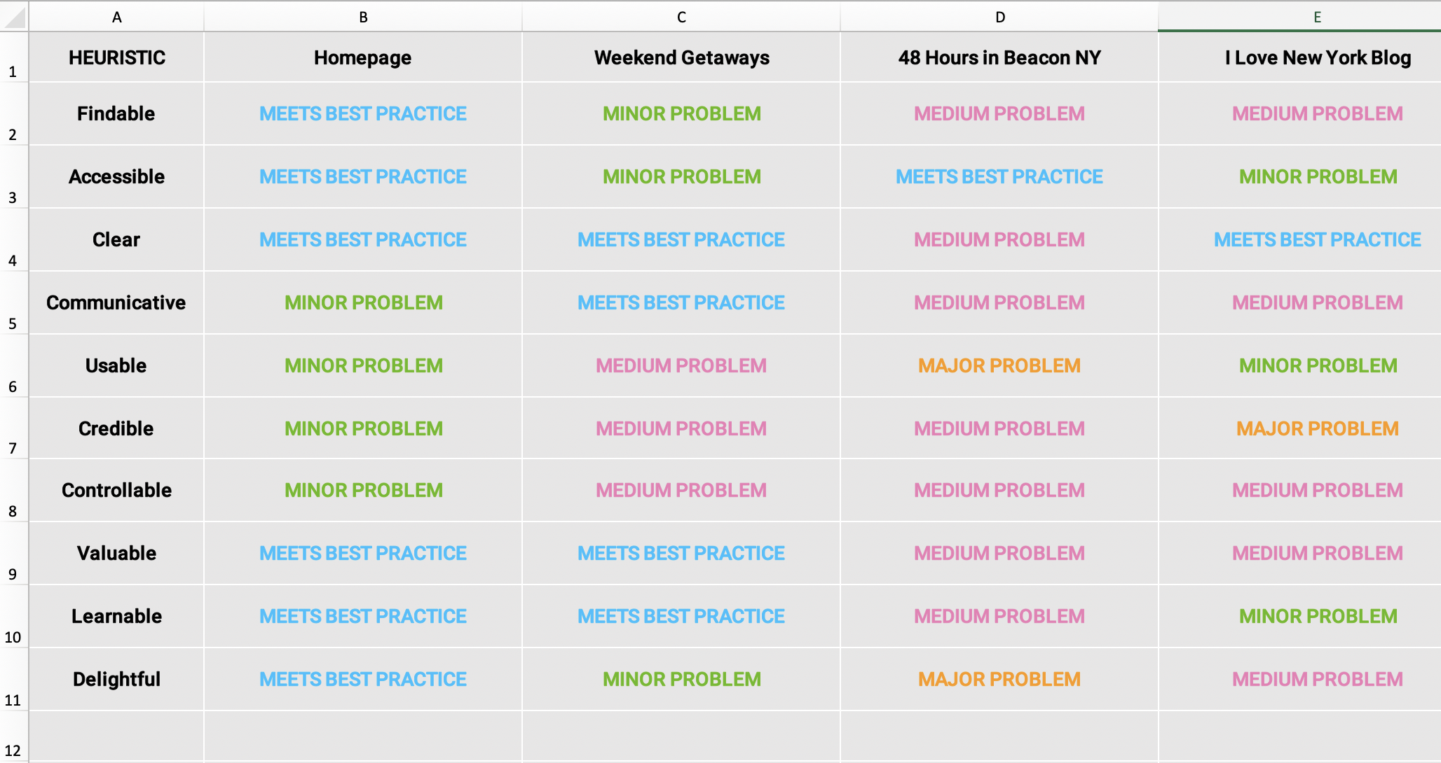
First step: heuristic analysis of 4 pages Sam might use to plan a getaway. This would help me detect usability problems in the existing site.
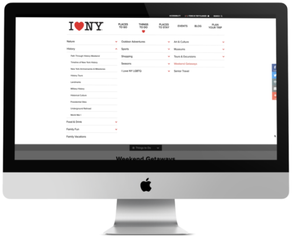
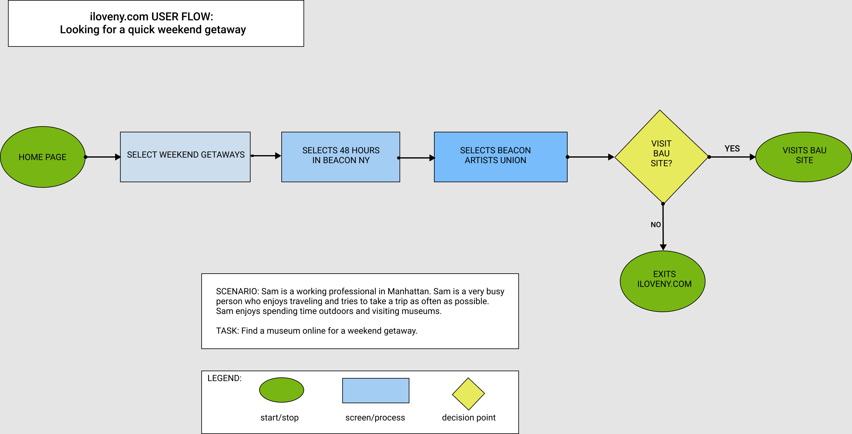
From the homepage, Sam goes to Weekend Getaways, then 48 Hours in Beacon, ending up at the site blog.
Things started out fine from the visually delightful homepage, on which “Weekend Getaways” displays over a beautiful full-size photo. Digging deeper, questions arose.
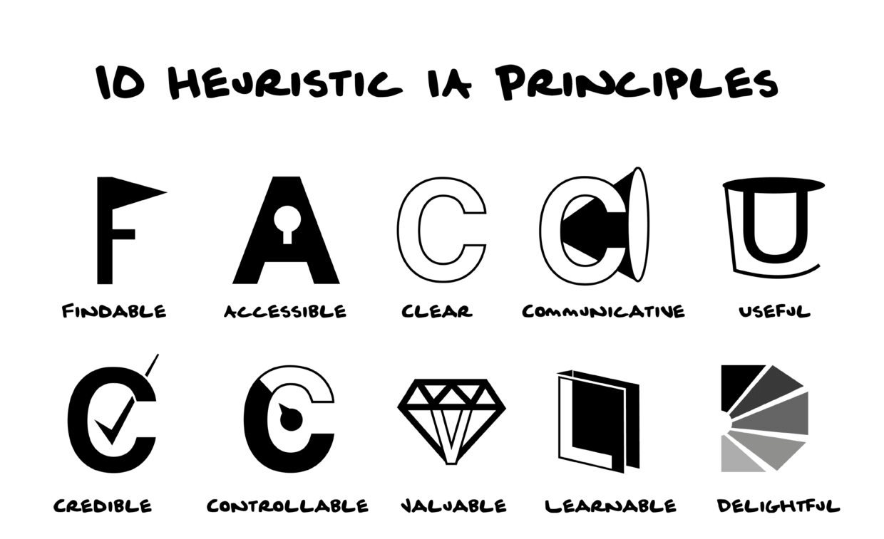
Abby Covert’s 10 Heuristic Information Architecture Principles
Analysis Summary, iloveny.com
CHALLENGE: A CONFUSING MAZE
- Some pages provide a “Back to Previous” page, and others don't.
- Weekend Getaways features 8 getaways, but what if Sam wants something else?
- How does the blog, with content dating to 2014, serve a user who just wants a quick getaway?
- Will a real person answer that 800-number? Sam doesn’t want to wait for a recording.
- Does Sam search the blog by travel date, or post date?
- Sam must scroll far down the blog for directions from Manhattan to Beacon.
PROCESS: SITEMAPS, CARD SORTS, USER FLOW
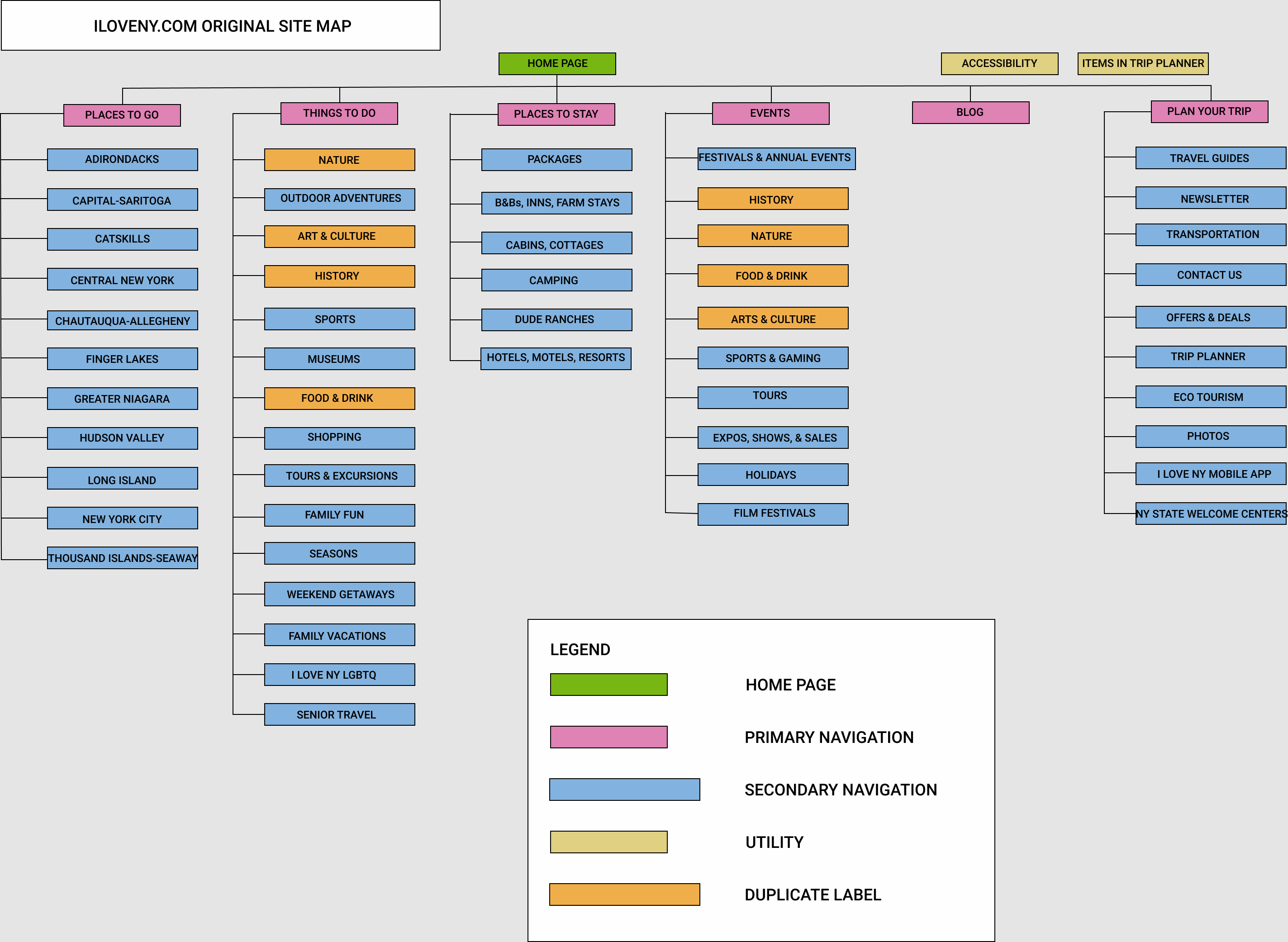
A visual sitemap of the existing website revealed more displacement. Duplicate labels were applied to similar, but slightly different pages: Nature, Arts & Culture, History, Food & Drink. Other pages had similar, but different labels and content. That friendly homepage could lead to who knows where.
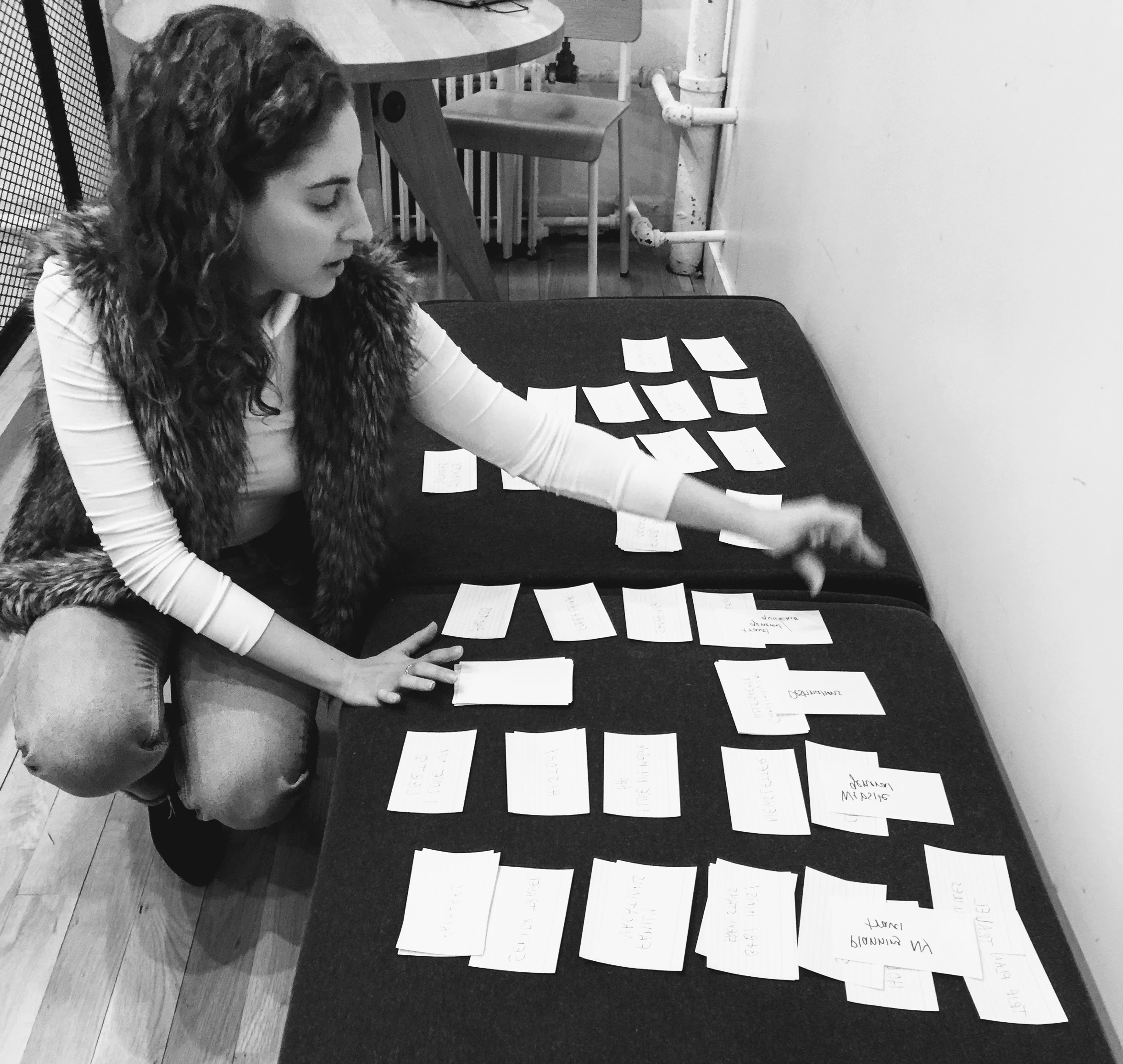
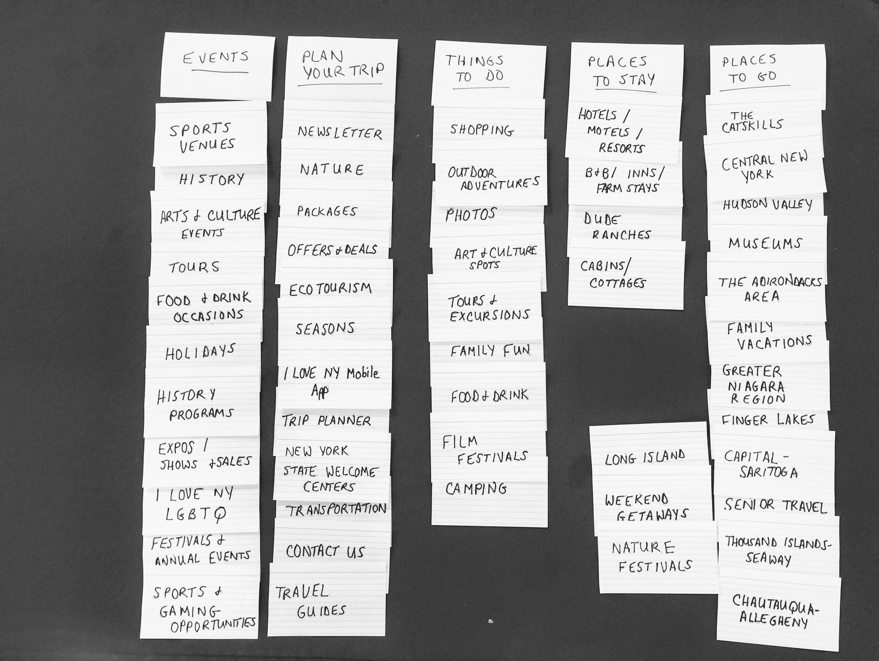
I conducted 10 in-person card sorts, 5 open and 5 closed, to learn their understanding of the site's categories and labels. Ten men and women ages early 20s to early 60s participated. Participants spent varying amounts of time. Open sorting typically took longer, up to 20 minutes. Closed card sorts went much faster, some only a few minutes, no questions asked.
Original Site Map
Open Card Sort
Closed Card Sort
Observations: Participants easily sorted cards with regional names, but not all names were familiar. One tester thought Catskills was a Broadway musical. No one knew a Dude Ranch was a Place to Stay. Things to Do and Plan Your Trip categories had much overlap, with sorters putting many cards in these categories, but not consistently. One sorter noted that labels like Senior Travel, Family Vacations, and ILoveNY LGBTQ could be grouped together in several categories. Events overlapped with Things to Do.
Insights: Several existing category labels were too vague to be useful. Other labels assumed a knowledge of the area that not everyone has. Some terms may be outdated.
User Flow
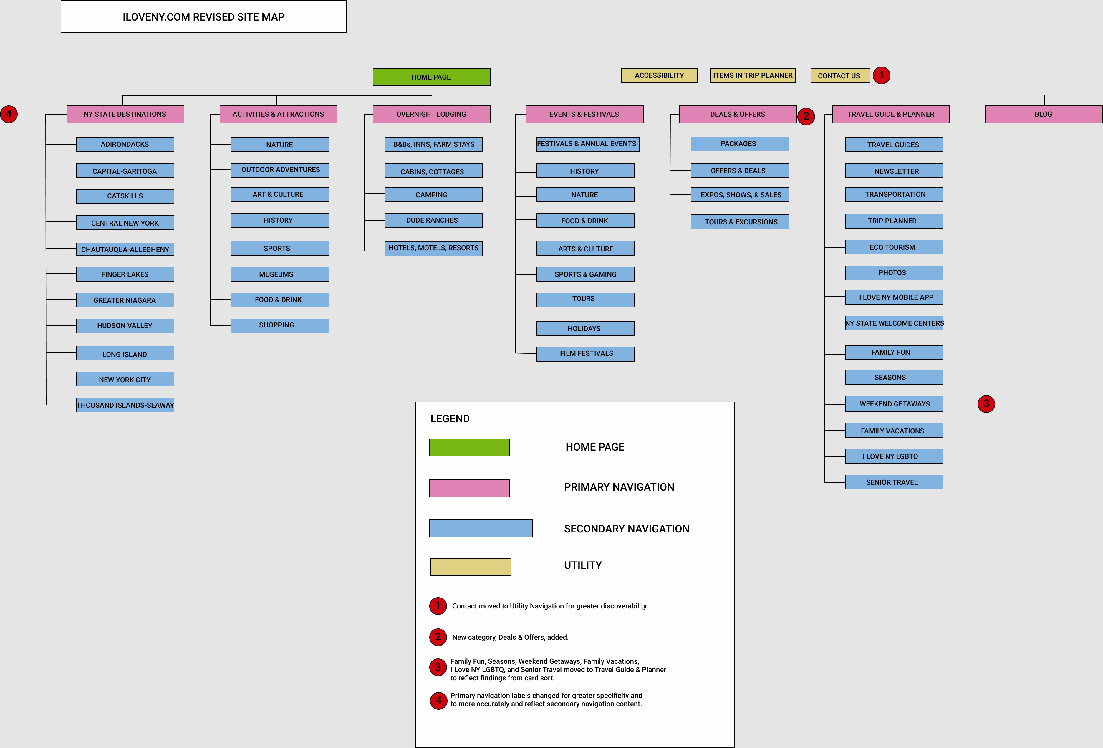
Revised Site Map
From the card sorts, I created a user flow to visualize how Sam might accomplish their goal simply, with one decision point.
I then created a revised sitemap with my recommendations, including new navigation labels and a new category. Contact Us is moved to Utility.
NEXT STEPS
- Change primary navigation labels for better clarity and structure.
- Update blog design and content to be more in line aesthetically with other site pages.
- Change or delete outdated terms.
- Conduct additional card sorts to assess user’s mental model with new architecture.
LEARNINGS
An archivist of many years, I’ve organized a lot of information, including websites. Information isn’t always where users expect it to be. Links die, images disappear, labels no longer convey their original meaning. Working now from a user-centric rather than document-centric focus, I see those discrepancies even more. We all have unique ways of thinking, and we understand information, labels, structures differently. As UX designers (and archivists), we want users to feel at home wherever they go.
© 2026 Jacqueline Rider