Send money and hope for the best doesn't work any more.
Volunteers want to help groups whose mission is clear.
We want to make a real impact, online and off.
OVERVIEW
For almost 30 years, Food Bank NYC has been feeding hungry New Yorkers 58 million free meals per year. My team was tasked with redesigning its responsive site. We focused on volunteers, the heart of this organization.
TEAMMATES
Caleb Ha, Peter Hsiao
ROLE
UX Researcher, UX Designer, UX Strategy
METHODS
Screener Surveys, User Interviews, Persona Development, Journey Mapping, Design Studio, Wireframes, Prototyping, Usability Testing
CHALLENGE: WHAT DOES IT MEAN TO VOLUNTEER NOW?
New Yorkers are hungry. FoodBankNYC’s website states:
- 1.4 million New York City residents rely on emergency food programs each year.
- 1 out of 5 NYC children rely on soup kitchens and food pantries.
- 14.4 percent NYC residents are food insecure.
And, New Yorkers are hungry to help those of us in need.
My team surveyed 23 men and women from the New York City area, age 19-50+, who volunteered at food banks. More than half were over 50. For 93%, volunteering was an important part of their lives.
Affinity Mapping
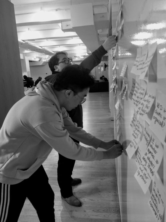
From those 23 survey respondents, we interviewed 6 users to understand their volunteer behaviors and problems they experience. We then synthesized their responses into "I Statements" that articulate their volunteering expectations:
- I learn about volunteering events from other people.
- I find information about an organization online.
- I look for events that are trustworthy and have a good reputation.
- I volunteer at events with a strong sense of community.
- I like events that are well organized.
So, credibility and discoverability of volunteer events proved to be the biggest pain points for our user, who is embodied in our persona and journey map.
The journey map, almost an afterthought in our process, proved to be essential for improving the mobile version. It enabled us to pinpoint opportunities to make the volunteer experience more discoverable on the app.
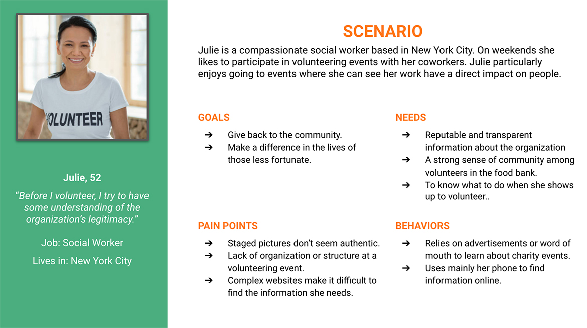
Persona
Primary User Journey Map
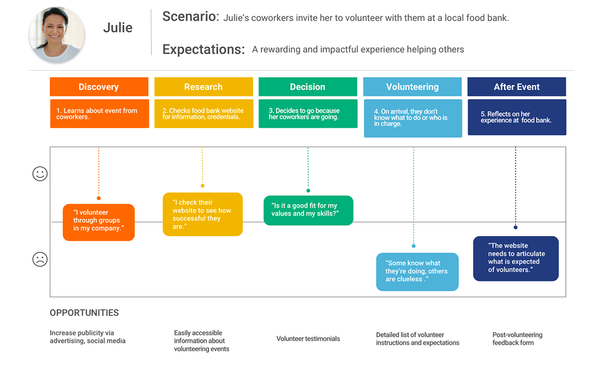
GIVING BACK SHOULD BE REWARDING
Problem Statement
Finding a trustworthy and reputable organization to volunteer can be a daunting task.
Julie is looking for an impactful way to give back to her community in her spare time.
How might we effectively communicate the credibility of Food Bank NYC and essential volunteering details on a mobile device?
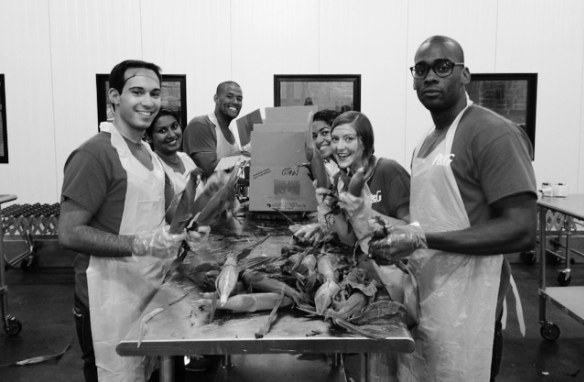
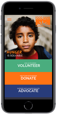
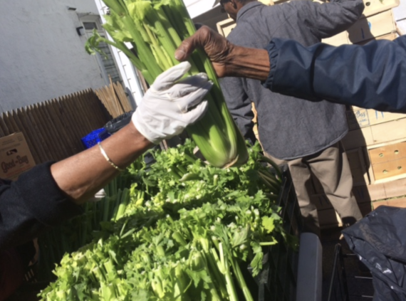
Food Bank NYC volunteers
PROCESS: GERMINATING POSSIBLE SOLUTIONS
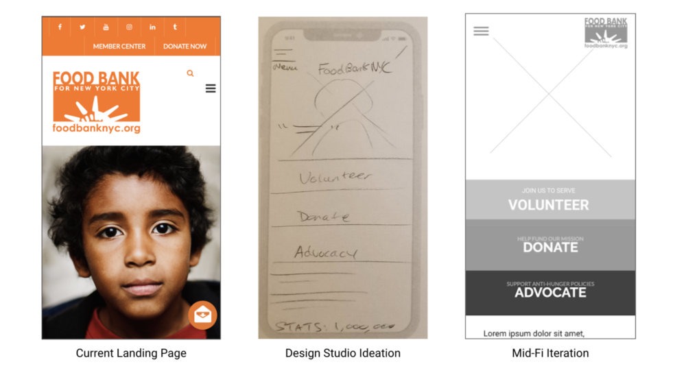
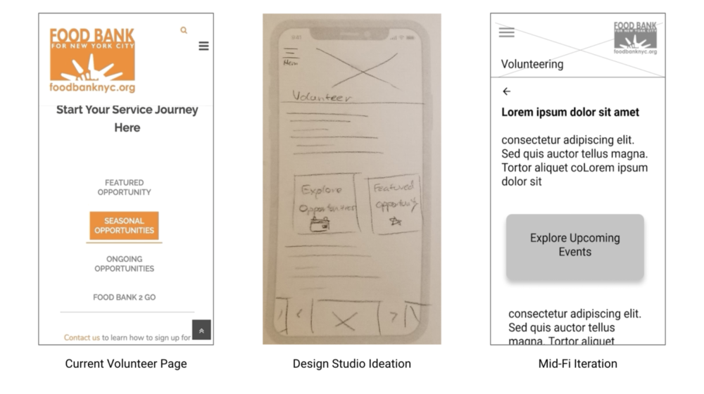
Usability tests of the existing app told us a lot. Given the organization’s reputation, it came as no surprise that testers easily found information about its trustworthiness. Learning about volunteer opportunities, however, led to a dead end.
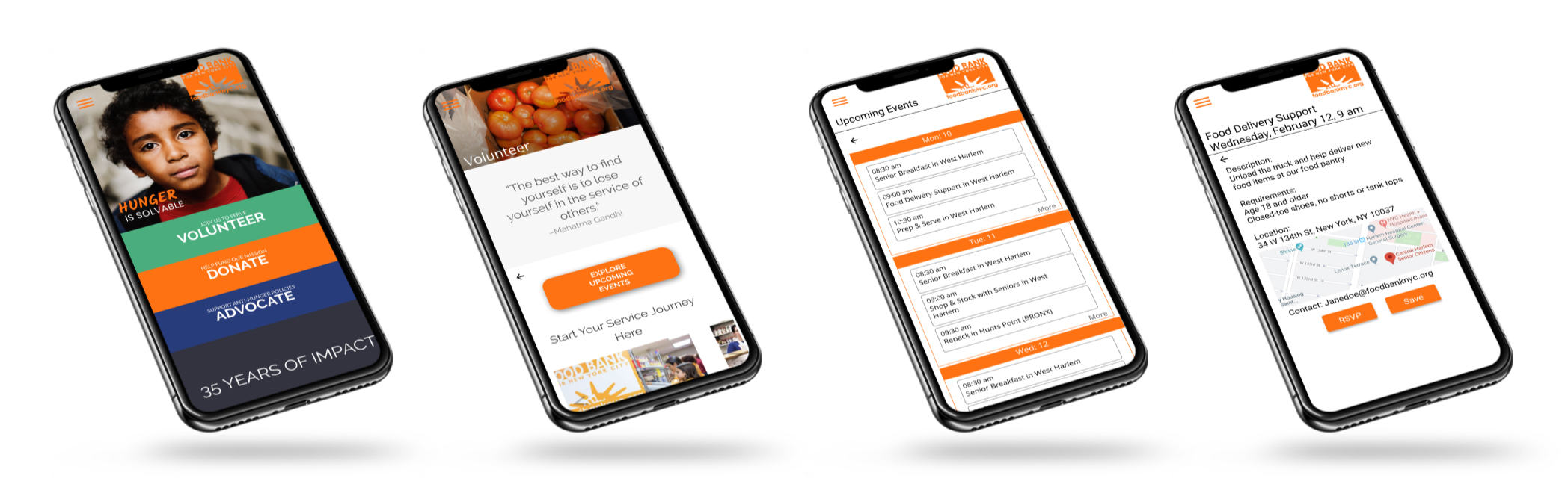
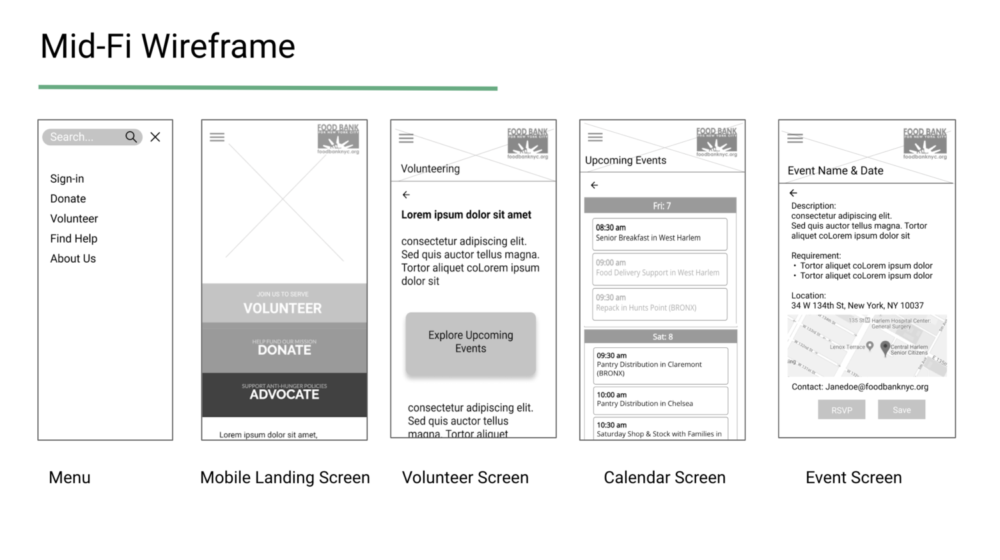
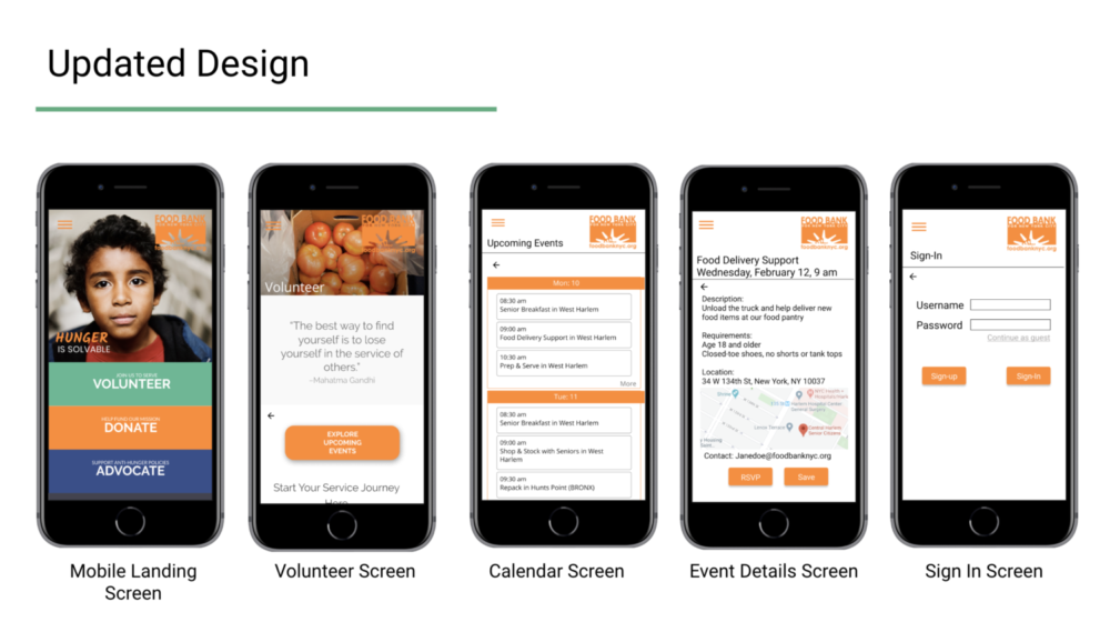
Design studios were really fruitful. Guided by our journey map, we improved navigation, designed prominent sign-up buttons, and added home content above the fold. Tests of our mid-fi wireframes and hi-fi mockups showed a 100% success rate.
PROTOTYPE AND USABILITY TESTING
Final usability tests confirmed the success of our redesign.
Task Success Rate: 6/6 users successfully found volunteering details.
6/6 said the task was easy to complete.
3/6 pressed “Continue as Guest” on the Sign In page.
“Nice map functionality.”
“The site is very credible and usable.”
Analysis: Testers found the pages easy to navigate and calls to action easy to identify. Testers scrolled down for more information, but returned to prominent buttons for next steps.
COMPLETING THE ONLINE LOOP
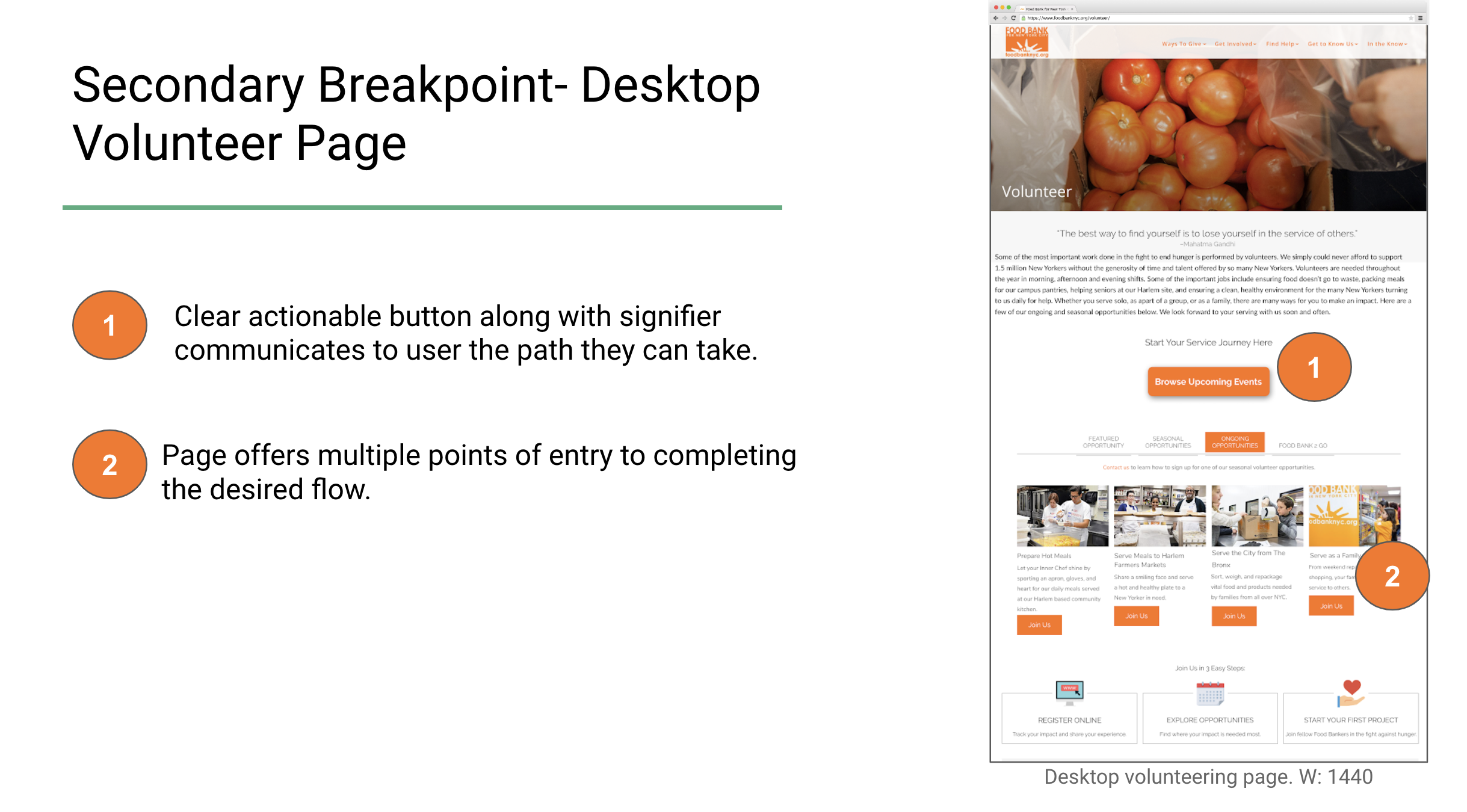
We rounded out the project with secondary breakpoints in the desktop home, volunteer, and calendar pages, replicating the new discoverability and navigation of the app's volunteer experience.
NEXT STEPS, LEARNINGS
Next steps: provide even more up-front volunteer information and choices:
- Create filter function for a jobs listing on calendar page.
- Add option to “continue as guest” on sign up/sign in page.
Future iteration might address how people seeking food experience the site. Do they feel welcome? Can they find what they need? How might we adapt lessons from this re-design to that target audience?
I've worked for nonprofits large and small. It's no longer enough to just show up. Volunteers look for organizations that project professionalism in a seamless user experience.
Our team collaborated throughout, creating together and divvying up tasks to meet deadlines. As Food Bank NYC's site states, it's a team effort.
Color photos courtesy of Food Bank NYC
© 2026 Jacqueline Rider